Dec 19, 2018 | news
On Beautiful Words
by Pablo Defendini
Writing is one of the most fundamental technologies humans possess. It is the most immediate and accessible way we’ve come up with to transmit our ideas to each other. Every movie, comic, song, advertisement — not to mention the stories you read here on Fireside — they all started out life as words on a surface. Design, printing, and code are all tools in the service of the words, and sometimes we come across pieces that lend themselves to using these tools in different ways, in ways that put even more power behind the words we’re publishing.
So one of the things we started doing this year at Fireside is expanding the format and presentation of some of our stories. We believe in high quality work above all, and we’re constantly exploring how we can best present the written word, both in print and on screen.
This is most visibly manifest in our printed edition, Fireside Quarterly, which is beautifully typeset and features enormous fold-out illustrations. We do things with the Quarterly that we can only do on paper, in print. Likewise, our technology stack for publishing online is nimble enough that we can design and build bespoke, highly art-directed presentations for our content on the web, and take advantages of the unique properties of screens in order to do some cool stuff online that you can’t do in print.
Take, for instance, a story we just published earlier this week: Fran Wilde’s journey into the grim reality of health care for wizards, ‘Choose Wisely.’ Fran structured the piece in a very particular way, hearkening back to some of the stories she enjoyed flipping through when she was growing up (you know the ones we mean). So it was only natural that we intersperse the pieces of her story throughout the printed edition of Fireside, in order to pay homage to those old adventure books.
Choose Wisely appears in the October 2018 issue of Fireside Quarterly in true pick-your-plot form: scattered throughout the issue.
— Fireside Magazine (@FiresideFiction) December 18, 2018
Don’t miss this immersive maze of of medical meta quests. https://t.co/oUwiFoWtem pic.twitter.com/XPIEmsGuzl
In the ebook edition of Fireside Magazine, which goes out to all our subscribers on the first of every month, ‘Choose Wisely’ looks a little different: the reader uses links to go from one section to the next. And online, it’s links again to go from one page to another.
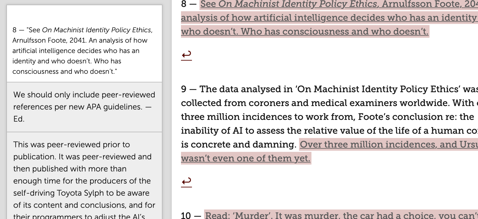
Another great example is ‘STET’ by Sarah Gailey. This story also plays with structure, but in a different way: it buries a gut-wrenching narrative deep inside two and sometimes three layers of editorial back-and-forth in the comments of a very short bit of text. It’s an inside baseball meta narrative that, at first glance, seems a bit difficult to work with (and it was — that’s half the fun of it, though). But when we approached each edition of the story on its own terms, thinking about how we could present the story in ways that took advantage of each medium’s strengths, we started to see some real possibilities.
In print, STET is a bunch of handwritten notes scrawled on a printed out manuscript. The messy arrangement and the rushed handwriting speaks to the state of mind of the characters, and reinforces the hot anger that one of the characters builds up over the course of the narrative.
Here's what STET looks like in print. Only way to see it is in the October issue of Fireside Quarterly, which is shipping now. Subscribe here: https://t.co/zcDrRnSyAO pic.twitter.com/JjOspBIJpq
— Pablo Defendini (@pablod) November 16, 2018
On the website, STET feels very different. A bunch of images of handwritten notes would look fake and contrived, so we decided to explore what the editorial back-and-forth would actually look like. Turns to we didn’t have to go far, since we use these tools every day. STET, on the site, looks like a bunch of google docs-style comments on top of the main text. This again works well in the service of the story — the cold, grey boxes with basic text emphasize some of the passive aggressive communication in the story.
‘STET’ and ‘Choose Wisely’ are the types of stories that come to us with an offbeat format, and we work with the author to suss out the best way to present it. But sometimes we come across something so evocative, that what we want to do is simply amplify what’s there. That’s what we did with the first poem we ever published: ‘Thunderstorm in Glasgow, July 25th 2013,’ by Amal El-Mohtar, illustrated by Molly Crabapple.
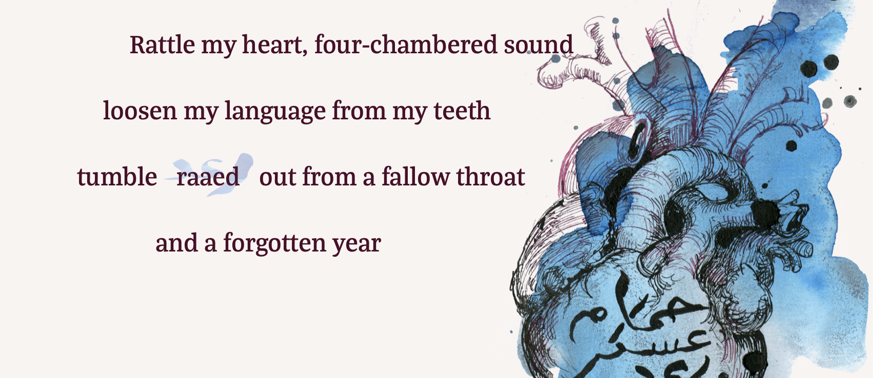
This personal poem hit us all in the feels immediately. We knew it was an impactful piece, and needed to have an impactful presentation. We also wanted to bring to bear the unique qualities of what I call a ‘digital broadside.’ When I first read the poem, it resonated deeply with me as someone raised between two cultures. So we looked for an artist who not only shared those reactions, but also brought her perspective as a visual chronicler of modern day Lebanon. Molly was a perfect fit. In between emoting at each other over the tone Molly was picking up from Amal’s words, they compared notes on their understanding of that old barracks in Beirut, your typical friendly neighborhood conversation about how the block has changed over the years.
The resulting illustrations Molly came up with to accompany the poem are evocative and visceral, beautiful compliments to the words on the screen. We also relied on Molly’s Arabic calligraphy skills to bring to life some of Amal’s words — we created rollover images of the Arabic words in the poem, so that the reader can toggle between the Arabic script and the latinized transliteration, right on the appropriate line of text.
Finally, we added a subtle little touch, which I haven’t mentioned much before: the colors of the text and the background of the website shift veeeeeery slowly over time, though a preset range of colors. It’s barely noticeable — and definitely not a shift that’s fast enough to trigger photosensitive reactions, just in case. It is meant to almost subconsciously reinforce the feeling of a thunderstorm: the slowly changing sky, churning through greyish versions of the color wheel. If ‘Thunderstorm in Glasgow’ makes for a slightly cozier read for you than other things online, now you know why :)
As we now move into doing audio production for our stories in the new year, we’re getting a feel for the tools and the workflows needed to create compelling, high-quality audio, and we’re looking forward to exploring interesting things we can do in that medium as well, over time. In the meantime, we’re always looking for cool weird new things to publish — if you’re a writer of words, we just so happen to be open to submissions right now, so you know what to do. And if you’re a reader like me, then consider supporting our work by subscribing to Fireside Quarterly. Your direct support is what allows us to keep putting beautiful words out into the world.
As always, thanks for reading.
© 2018 Pablo Defendini
About the author